b.box body
A refillable skincare range designed for modern family routines.
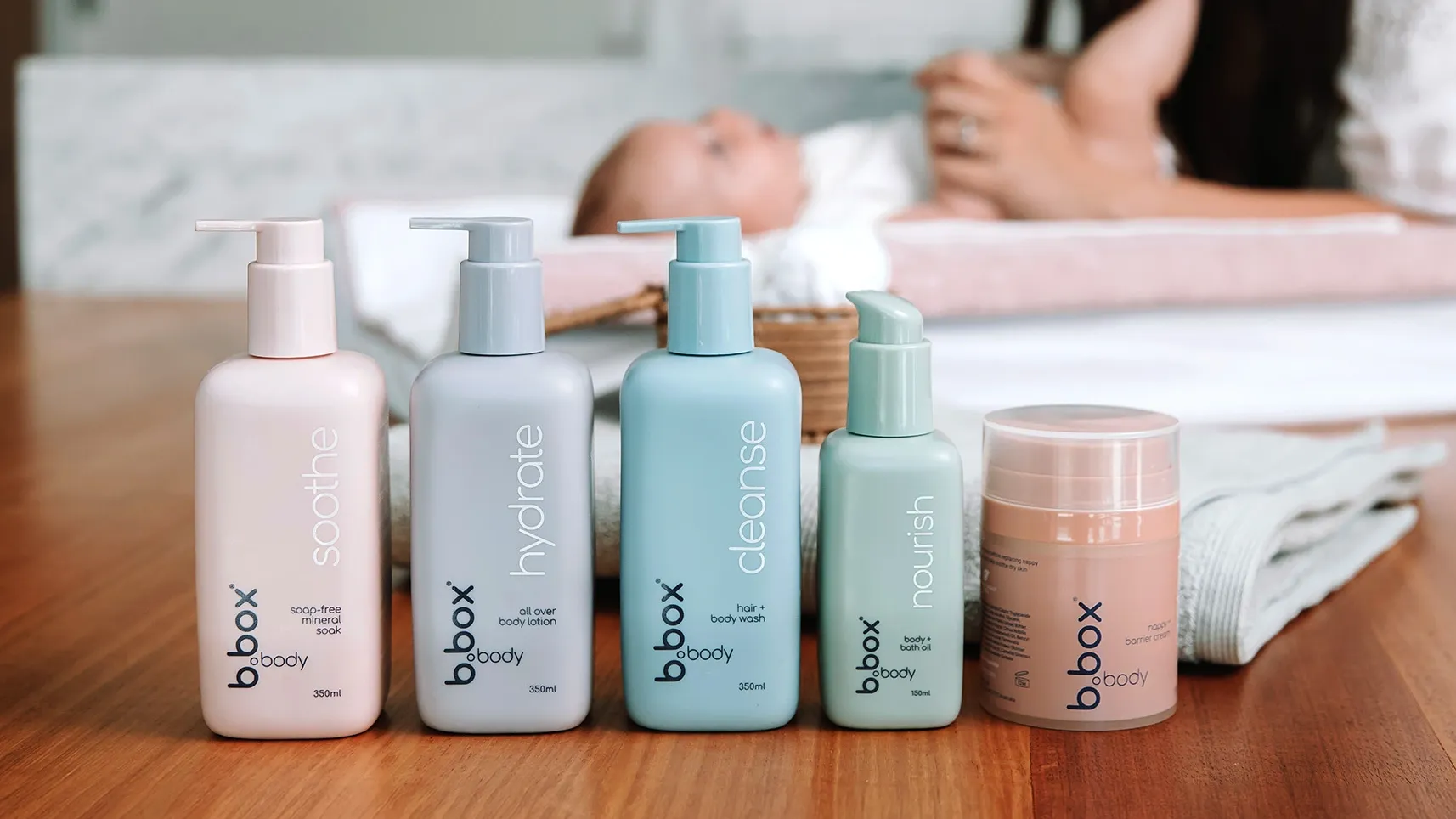
A new category for the brand
This project marked b.box’s move into family skincare. The brief was to create a product range that felt gentle, modern, and cohesive across multiple formats, while also supporting refill use and fitting the practical realities of cost, production, and shelf presence. For me, it was a chance to build something broader than a single product — a system of bottles, refills, and formats that needed to feel consistent as a family while still working hard in the real world.
The brief

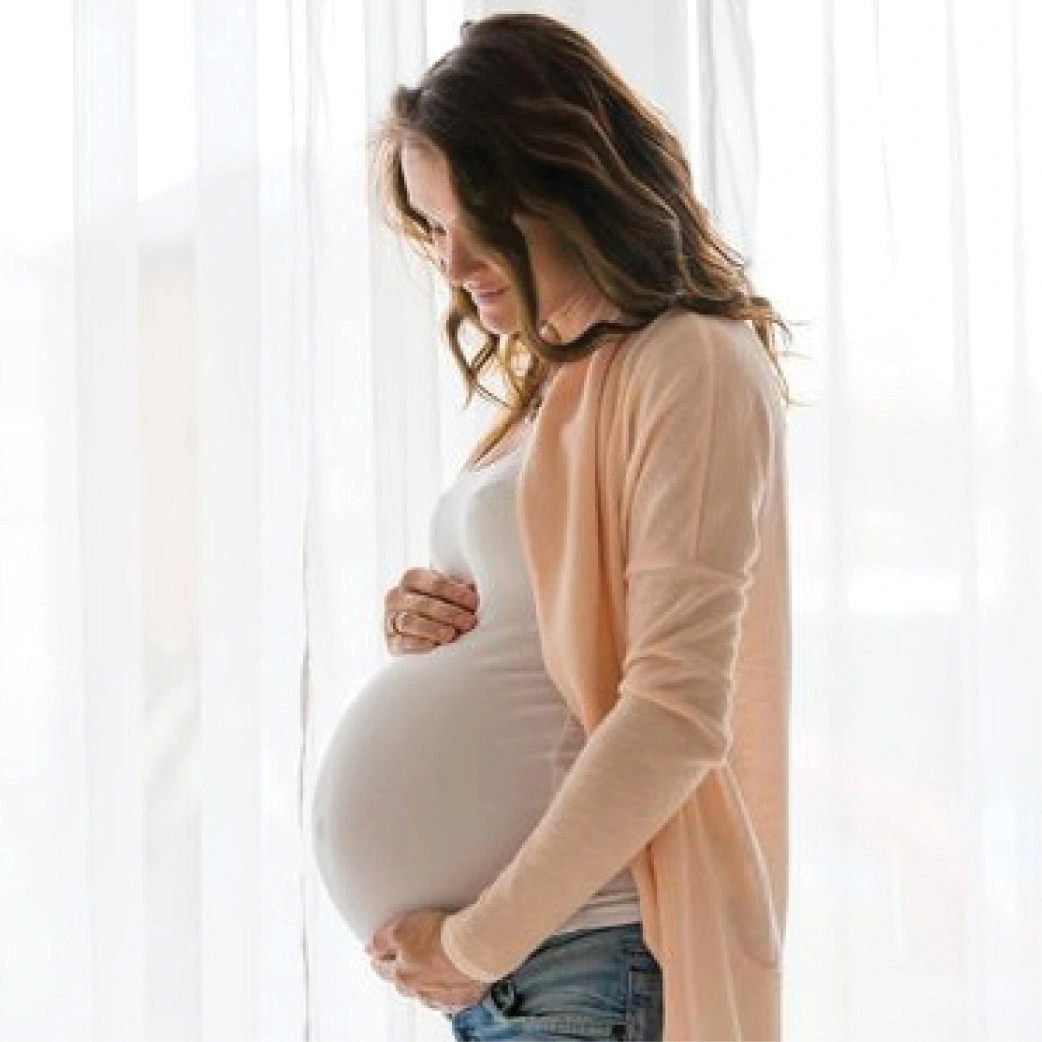

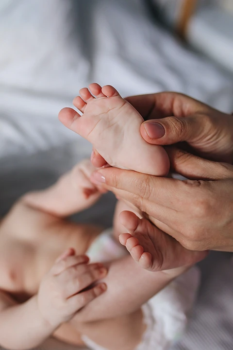
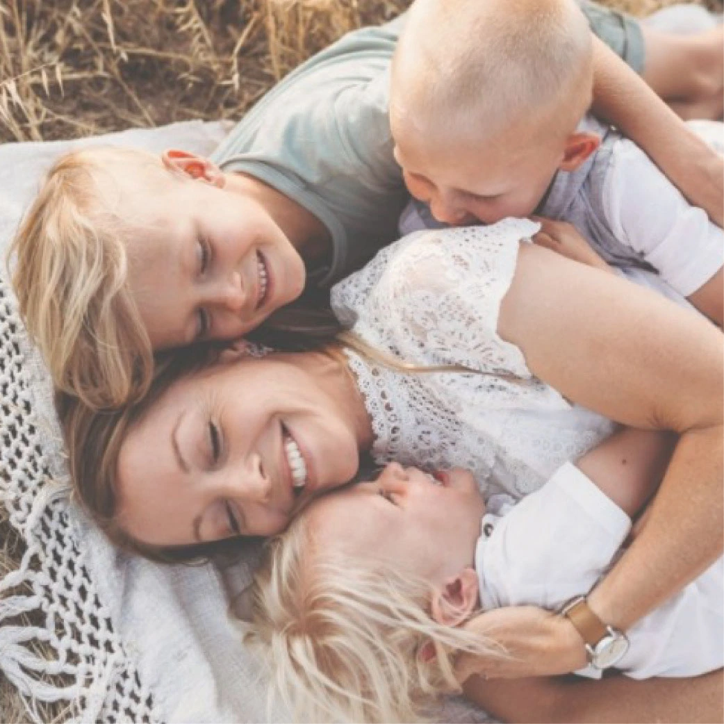
Design a family skincare range that feels premium but accessible, works across different product types, and introduces refill behaviour in a way that feels easy and intuitive. • Create a cohesive product family across lotions, oils, and creams. • Balance softness and premium appeal with clear brand fit. • Build refill and replacement formats into the system. • Keep the outcome commercially realistic to manufacture and launch.
Designing the range
The final range combines custom bottle forms, a refillable lotion system, and a dedicated airless cream format into one cohesive family. Each product was designed to feel soft and approachable, while still sitting comfortably within b.box’s wider brand language. The goal was not just to make individual packs look good on their own, but to make the full range feel consistent, flexible, and ready for everyday family life.
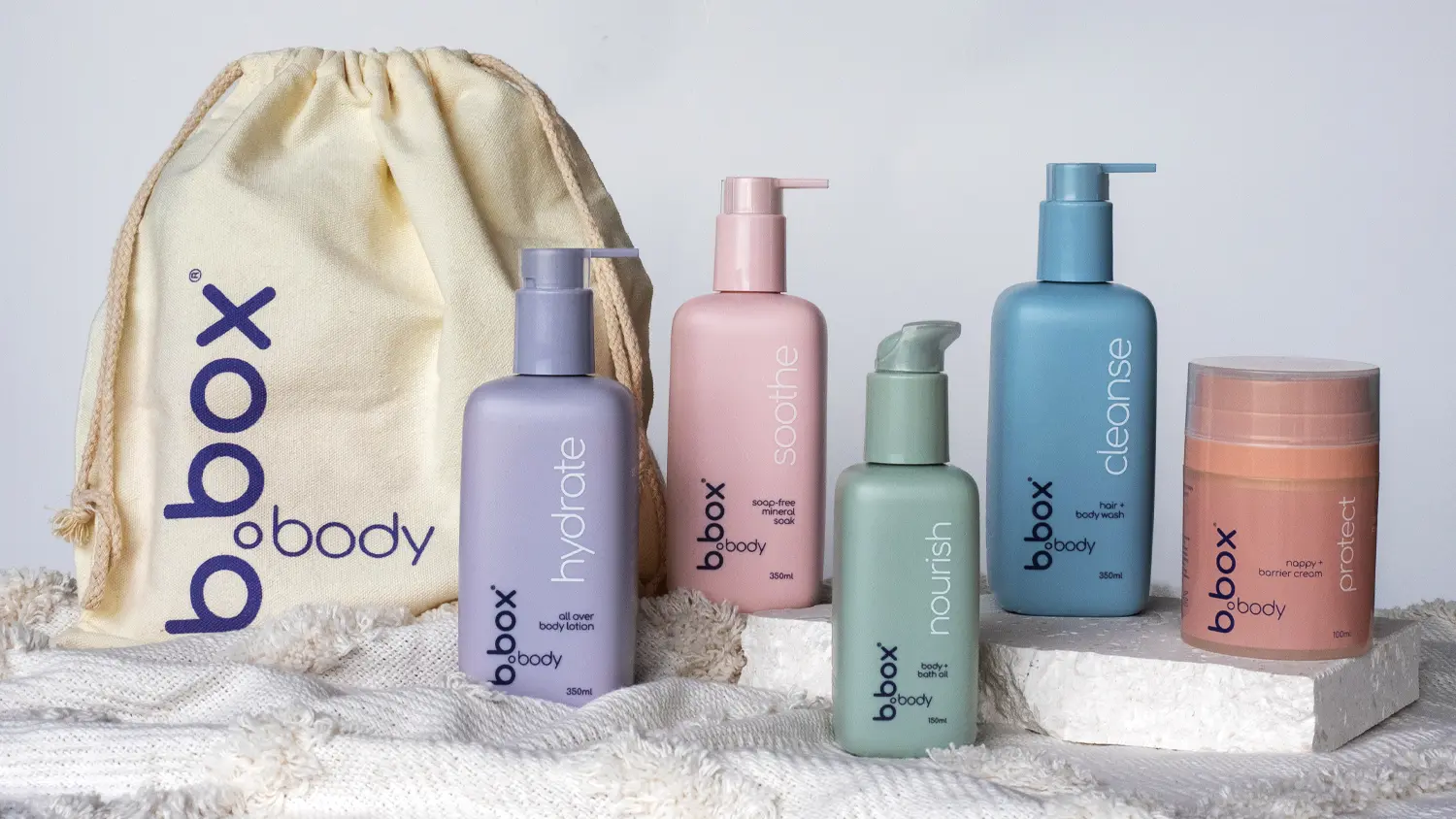
3 lotion bottles · 1 oil bottle · 1 airless cream format · refill pouches · replacement cartridges
Refill by design
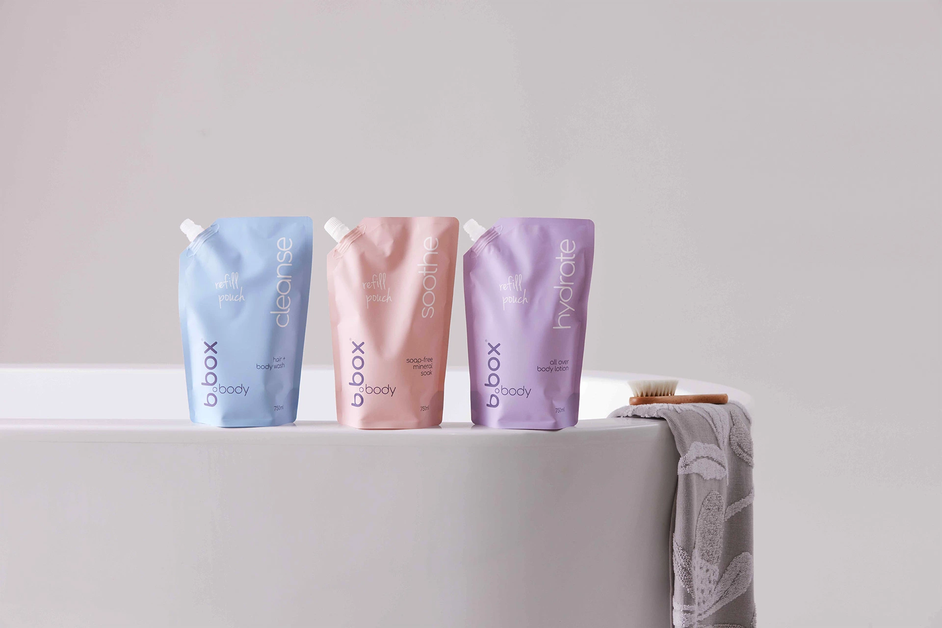
A big part of the project was designing beyond the primary pack. I developed replacement cartridges for the nappy cream and 750ml refill pouches for the lotion range, helping reduce waste while making the system more useful and economical over time. This part of the project pushed the work from packaging into system design — thinking about how the range would be used, replenished, and kept in circulation over a longer period.
In use
The final range was designed to feel calm, gentle, and easy to use in everyday family routines. The lifestyle imagery helped communicate that softness while showing how the products fit naturally into real moments of care.
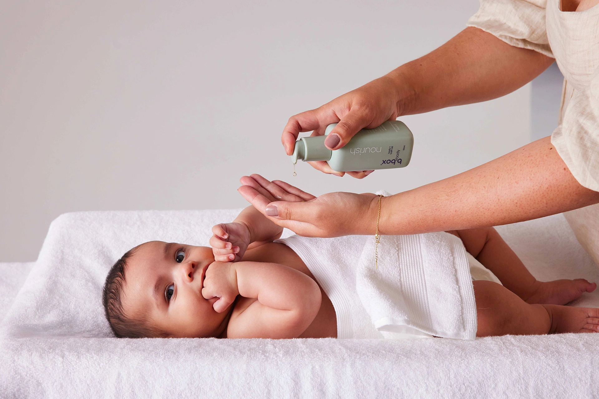
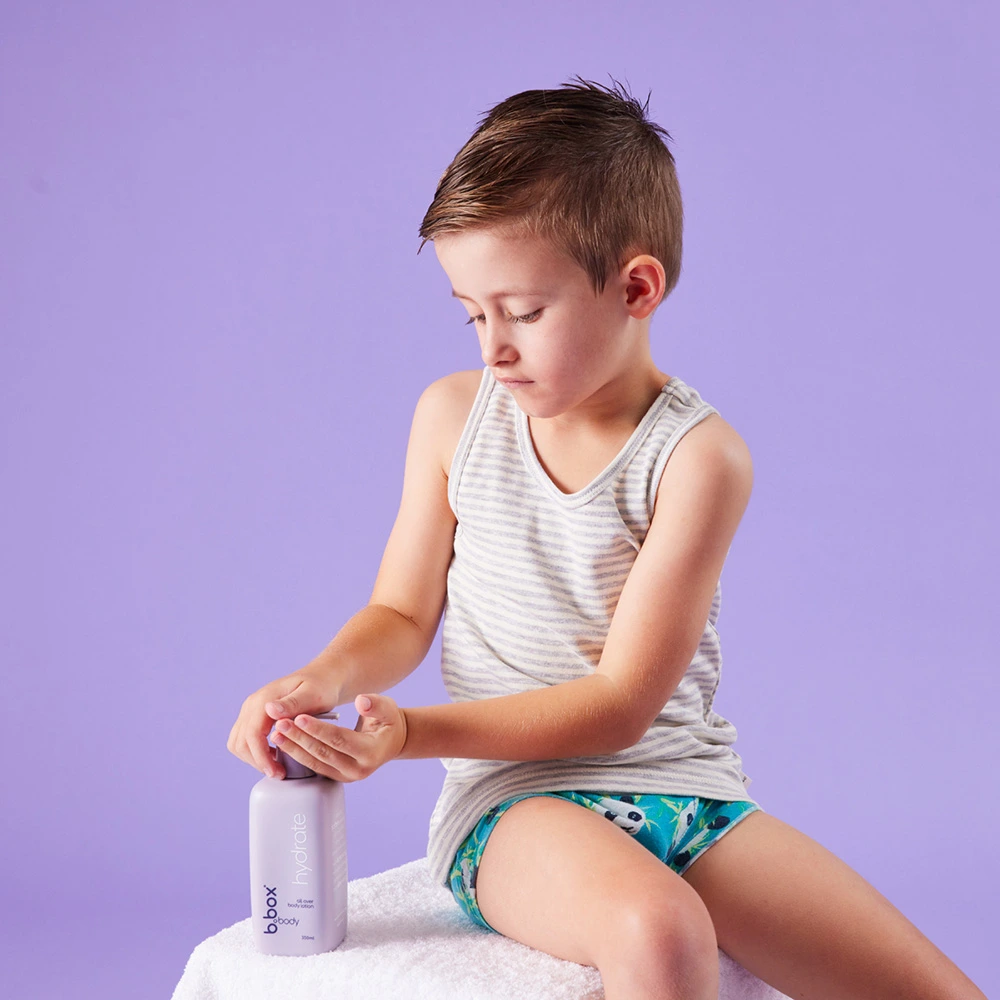
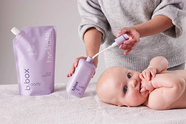
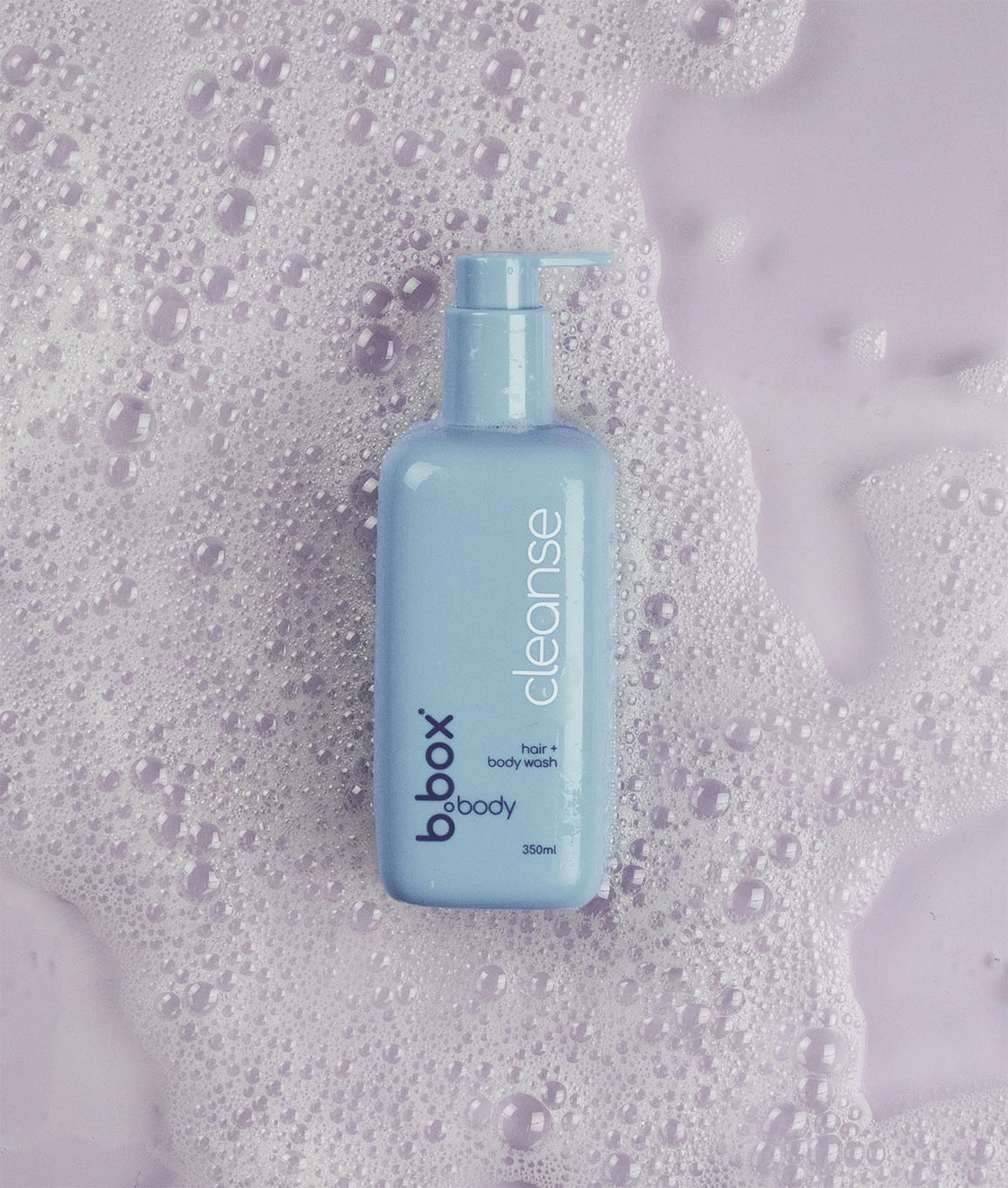
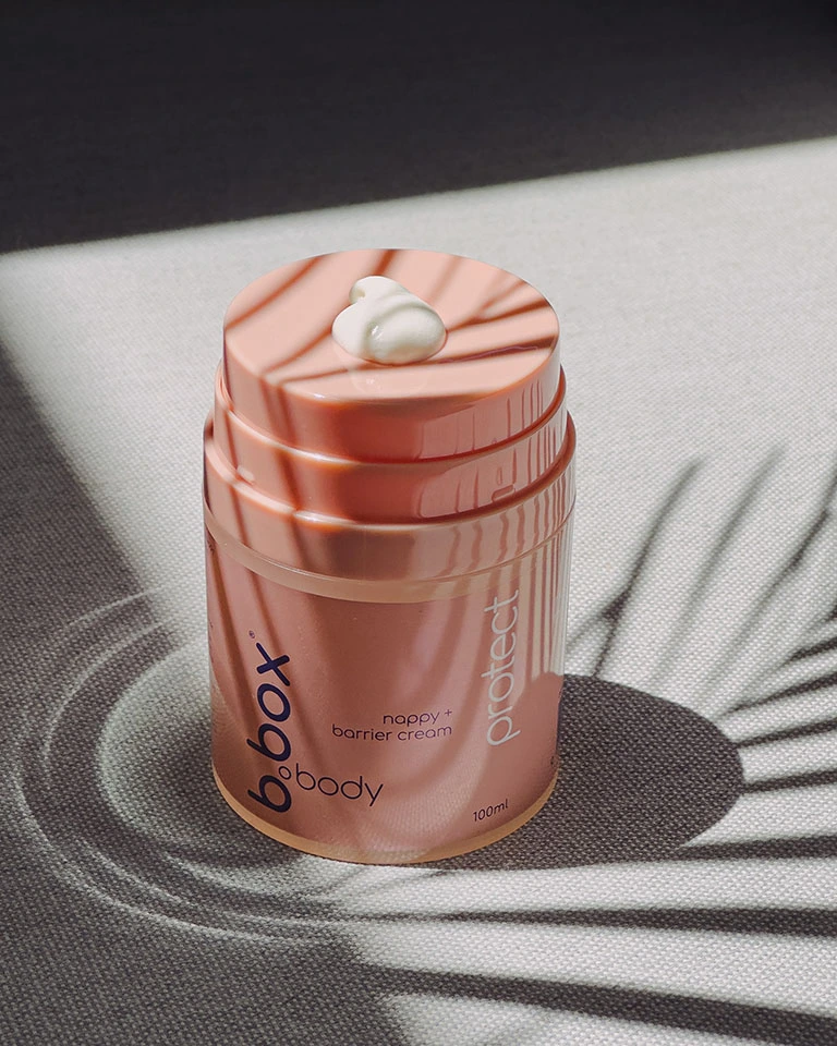

A product family designed to feel approachable in both form and everyday use.
From early character to commercial direction
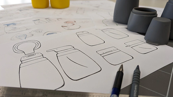
The project began with a more character-led concept, then shifted as the brief evolved toward a more commercially viable direction. The final approach paired custom bottle forms with white-label pumps, allowing the range to stay aligned with b.box’s brand language while also meeting tighter cost and production constraints. That shift was important. It moved the project away from novelty and toward a more balanced solution — something that could still feel distinctive, but would hold up in manufacturing, on shelf, and across a full product family.
Development
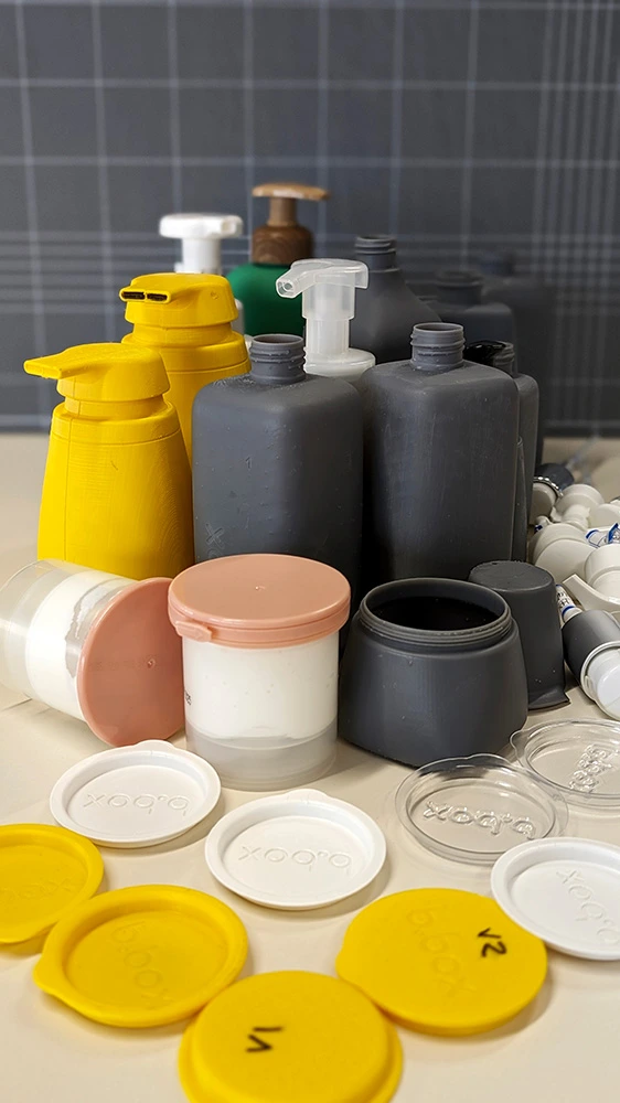
From there, I used a mix of FDM and SLA prototyping, alongside vac-formed models and factory samples, to test proportions, refine usability, and soften the overall form language. That iterative process helped shape the rounded-square silhouette that gave the range a more premium and considered feel. As the design moved closer to manufacture, I worked directly with suppliers to resolve feasibility, refine details for production, and prepare the technical specifications and tooling drawings needed to bring the range to market.
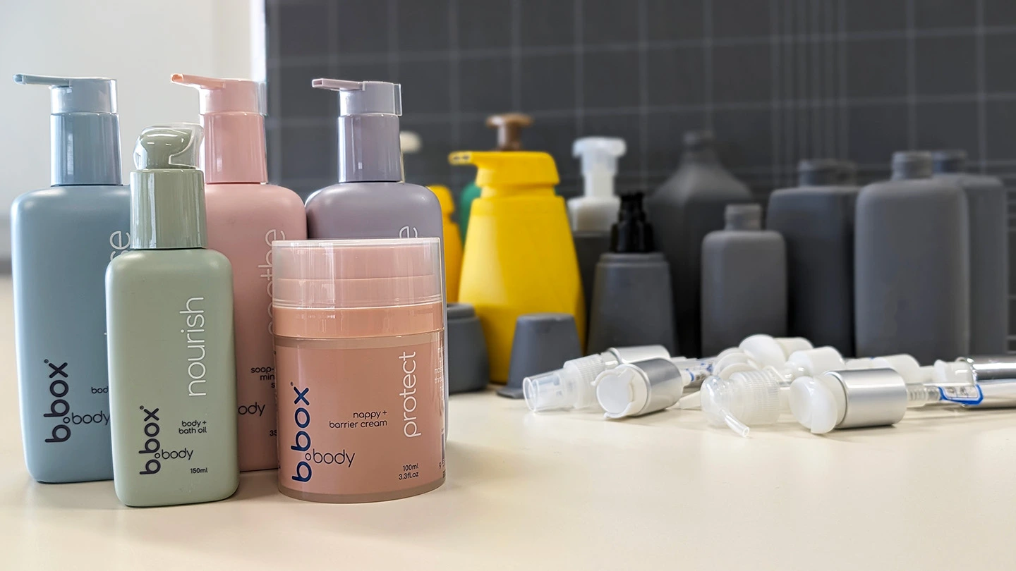
Refining proportion, softness, and manufacturability through repeated physical development.
Intellectual Property
To support international design registration, I prepared the technical drawings that defined the distinctive visual features of the range. The design was ultimately registered across more than 15 jurisdictions. This was an important part of the project because it required translating the product family into a clear and defensible visual language beyond the physical products themselves.
Outcome
The range launched in Australia in late 2022, marking b.box’s expansion into family skincare. For me, it was a project that brought together everything I enjoy most — developing a product family that feels soft and considered, while still being grounded in manufacturing, refill logic, and everyday usability.